

What is Flex-box why it is important to learn ?
Now a days, It is important to make the website responsive according to the different devices so, flex box helps us to make the webpage responsive. Using the few lines of code it can be done easily. In old days We used to use the float property but after coming the flex-box, things has become very easy.
How to apply flex ?
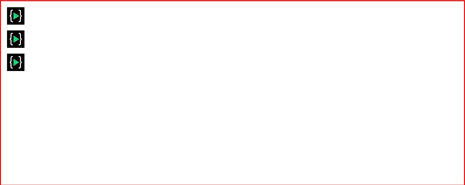
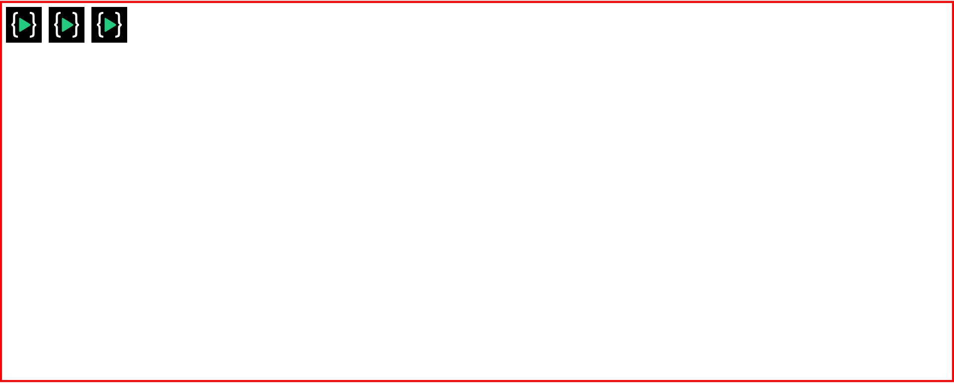
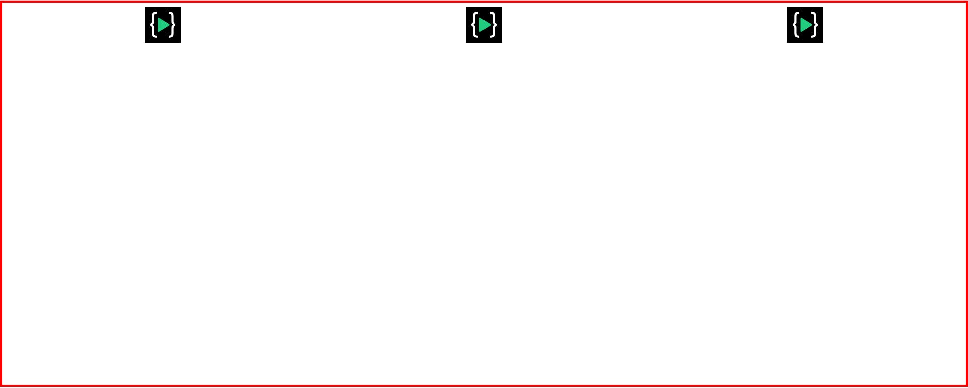
See the below image there are three boxes with the image which are positioned statically which is the normal order(top to bottom) of the html elements.
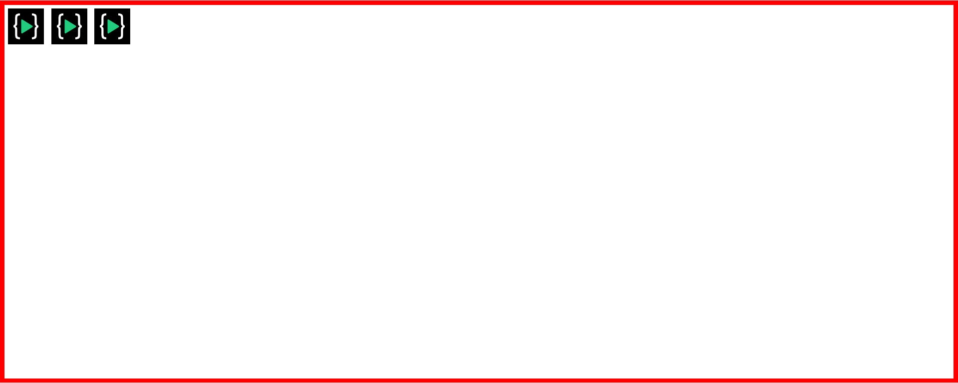
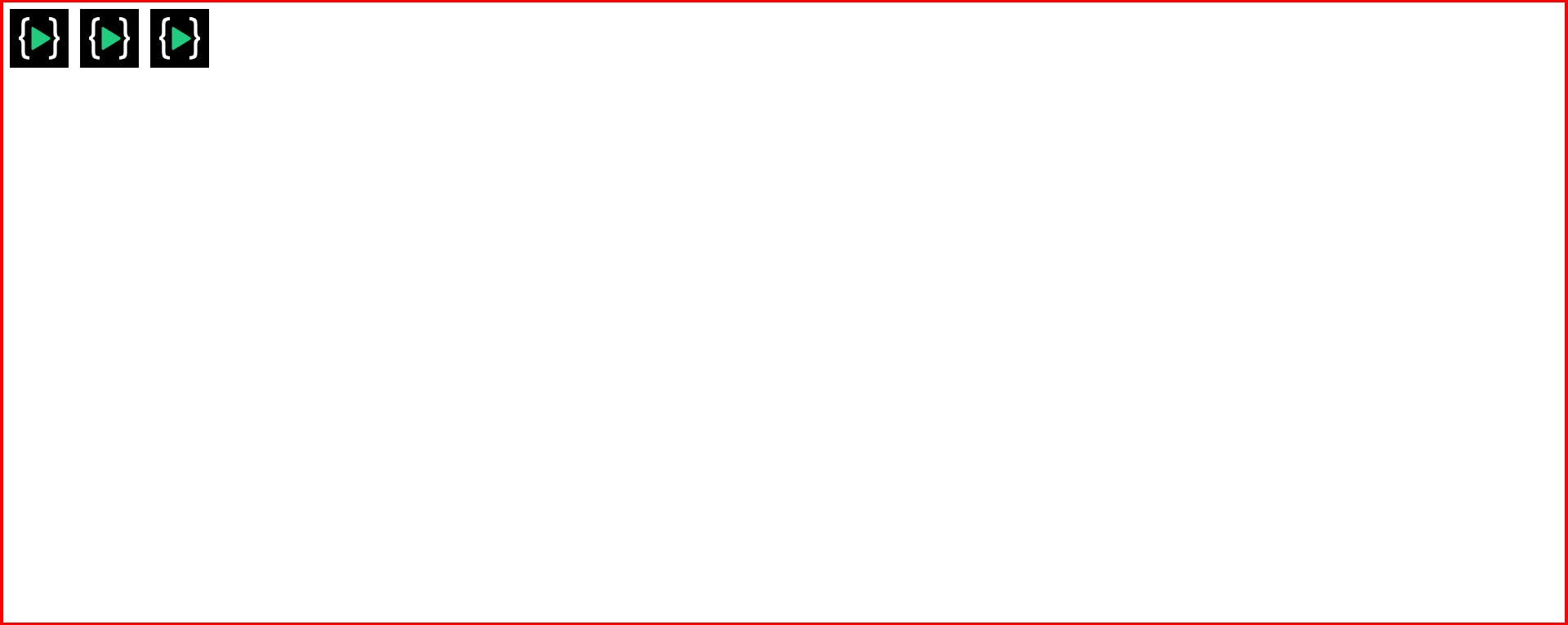
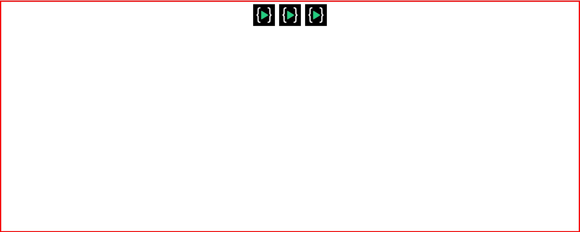
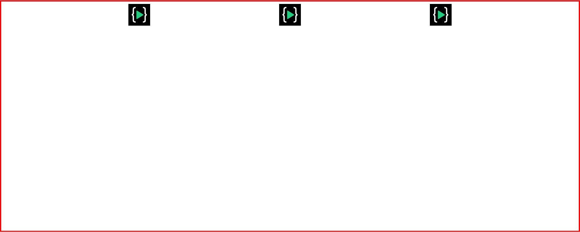
 but as soon as you put display flex to the parent container you will see these images or boxes showing side by side in one row. See the below image.
.container{
display: flex;
}
Flex-box always has a direction and by default this direction is horizontal (left to right). That's how it lays -out it's items and, that is called the main axis and We also have cross axis which goes from vertical (top to bottom). We can also flip the axis by changing the direction of the container (parent element). If We change the flex-direction to "column" then main axis would be vertical(top to bottom) and cross axis would be horizontal (left to right or row ).
How to position the elements along the main axis ?
Justify-content - center
We can align the elements horizontally center by using this property. See the below image to understand better.
.container{
display: flex;
justify-content: center;
}
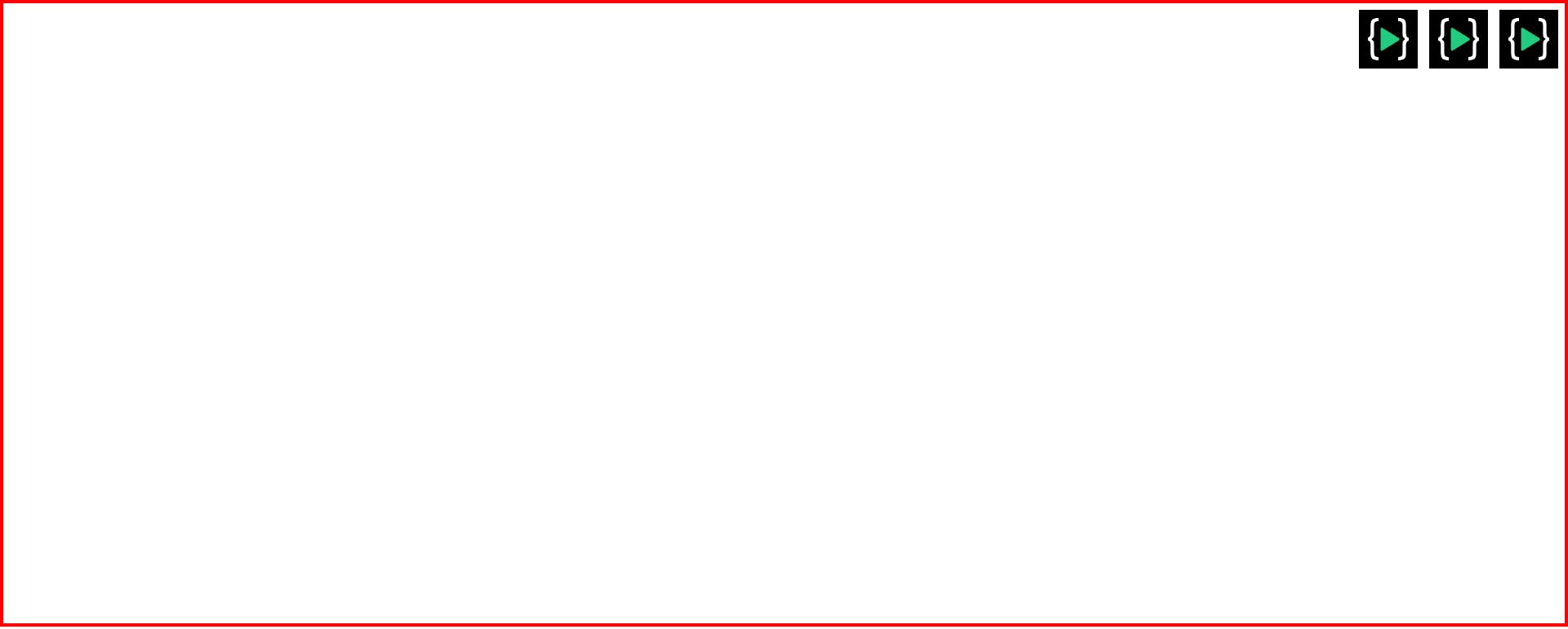
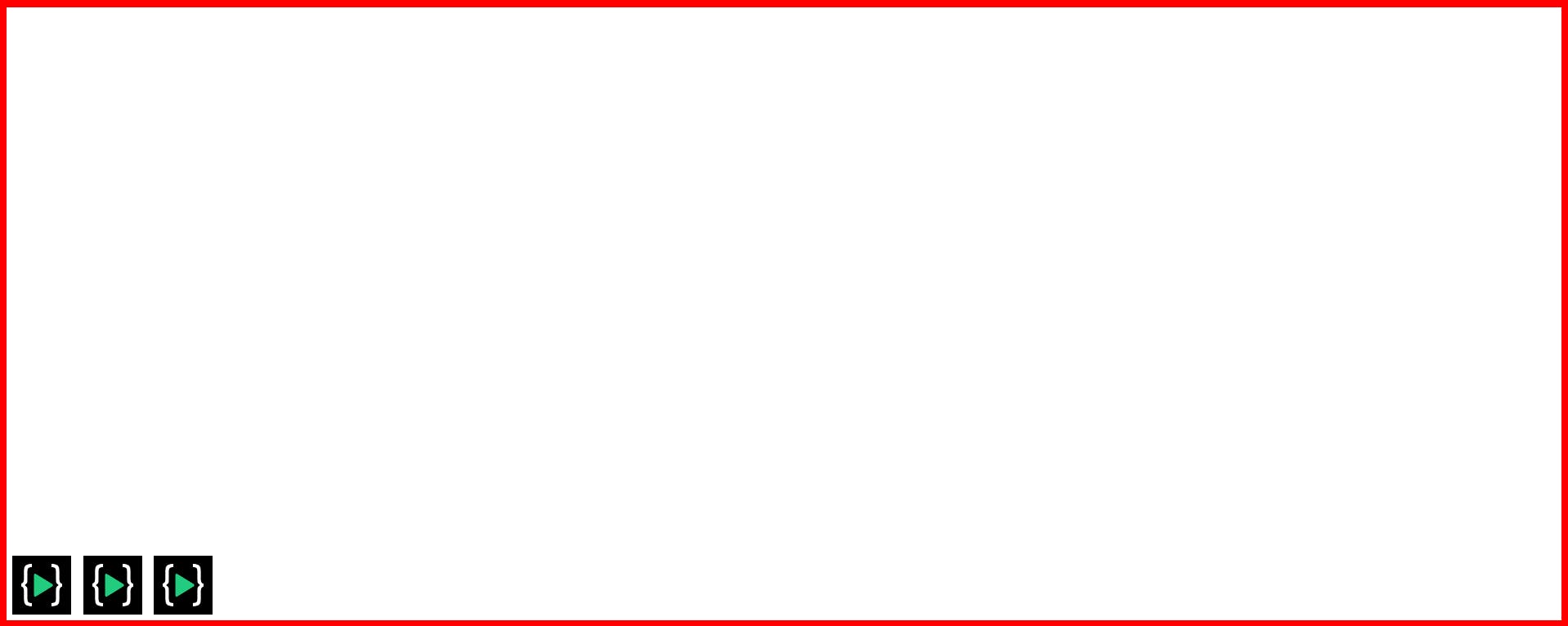
Justify-content - Flex-end
By using this property on the flex-container We can position the element horizontally at the very end of the main axis. See the below example
.container{
display: flex;
justify-content: flex-end;
}
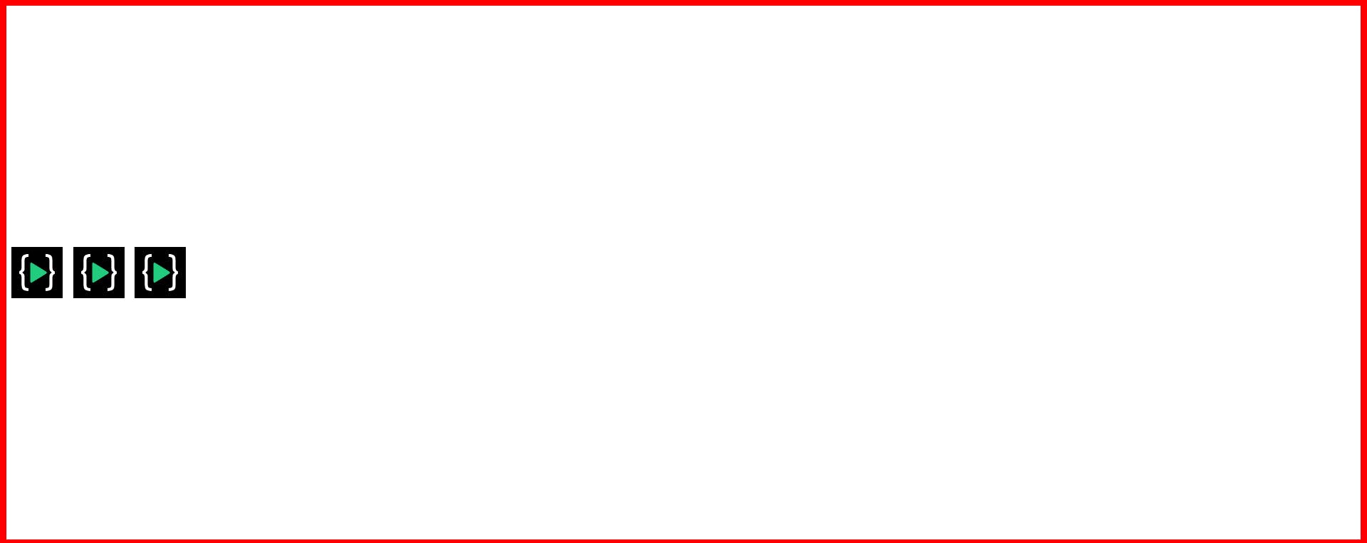
Justify-content - flex-start
This is the default position of the flex-box as soon as you put the display flex it will arrange the elements in a single row at the very start however you can set the justify-content - flex-start to arrange the elements in the start of the row. See the below image
.container{
display: flex;
justify-content: flex-start;
}
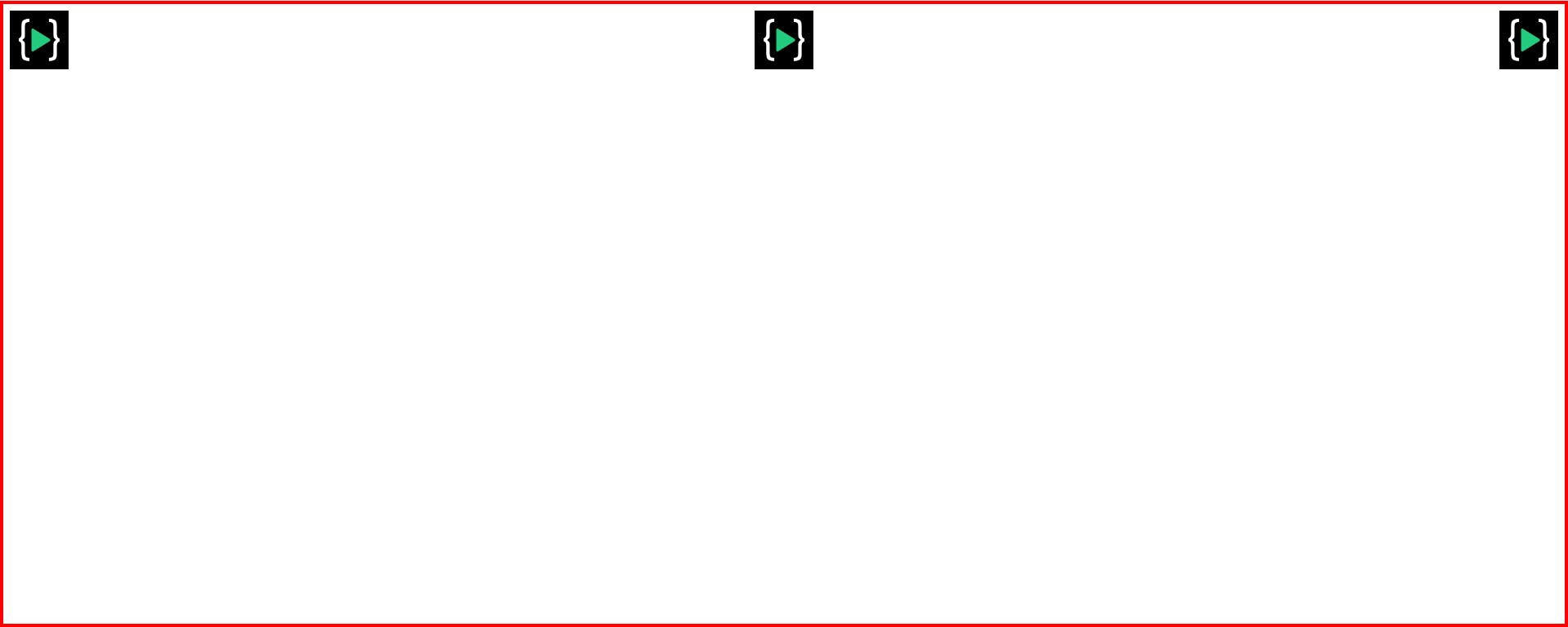
Justify-content - space-between
.container{
display: flex;
justify-content: space-between;
}
Justify-content - space-around
.container{
display: flex;
justify-content: space-around;
}
Justify-content - space-evenly
.container{
display: flex;
justify-content: space-evenly;
}
How to position the items vertically (or cross axis)
Align-items-center
We can position the items in the cross axis or vertically by using the below property :
.container{
display: flex;
height: 100%;
align-items: center;
}
Align-items-flex-end
.container{
display: flex;
height: 100%;
align-items: flex-end;
}
Align-items-flex-start
.container{
display: flex;
height: 100%;
align-items: flex-start;
}